


Feature Wiki
Tabs
Add QR Code Button and Share-Component to Footer for Page Permalink
Page Overview
[Hide]- 1 Initial Problem
- 2 Conceptual Summary
- 3 User Interface Modifications
- 4 Additional Information
- 4.1 Involved Authorities
- 4.2 Technical Aspects
- 4.3 Privacy
- 4.4 Security
- 4.5 Contact
- 4.6 Funding
- 5 Discussion
- 6 Implementation
- 6.1 Description and Screenshots
- 6.2 Test Cases
- 6.3 Privacy
- 6.4 Approval
1 Initial Problem
Sharing and typing links is cumbersome on desktop PCs and notebooks, but especially on mobile devices. Over the years, QR codes have proven to be highly effective for sharing links and other digital content, particularly for mobile usage.
2 Conceptual Summary
Add a button in the ILIAS footer next to the existing permalink copy button that opens a modal displaying a QR code. This would allow users to directly participate in surveys and polls by quickly accessing the object, or obtain a direct link to a course or a group they can join.
There are already several feature requests that align with this proposal and can be linked:
3 User Interface Modifications
3.1 List of Affected Views
- Footer
3.2 User Interface Details
According to the Footer KS Documentation, "section 1 (permanent-link) is composed only of a link to the current page, which can be copied by users." This rule would not be violated, as the proposed feature still only provides the link—this time additionally in the form of a QR code.
The mock-ups demonstrate two options: a standard button and a shy-button for displaying the QR code.
The documentation states under the Purpose of the Footer: "shy-buttons for triggering internal dialogs." Using a shy-button would be particularly effective, as it could incorporate an icon (see Screenshot 2) that visually indicates the button's function. Or you can simply use the icon itself as a button to trigger the modal (see screenshot 3).
However, the shy button is somewhat inconspicuous compared to the standard button and might be perceived less clearly, which is why a standard button, even without an icon, could be the better choice. Here, the UI/UX experts should be consulted.
The last mock-up shows the QR code containing the permalink to the object displayed in a modal triggered by the button. The Lightbox Image Page Modal was used for the presentation, shown in light mode rather than dark mode, as the QR code displays better in light mode.
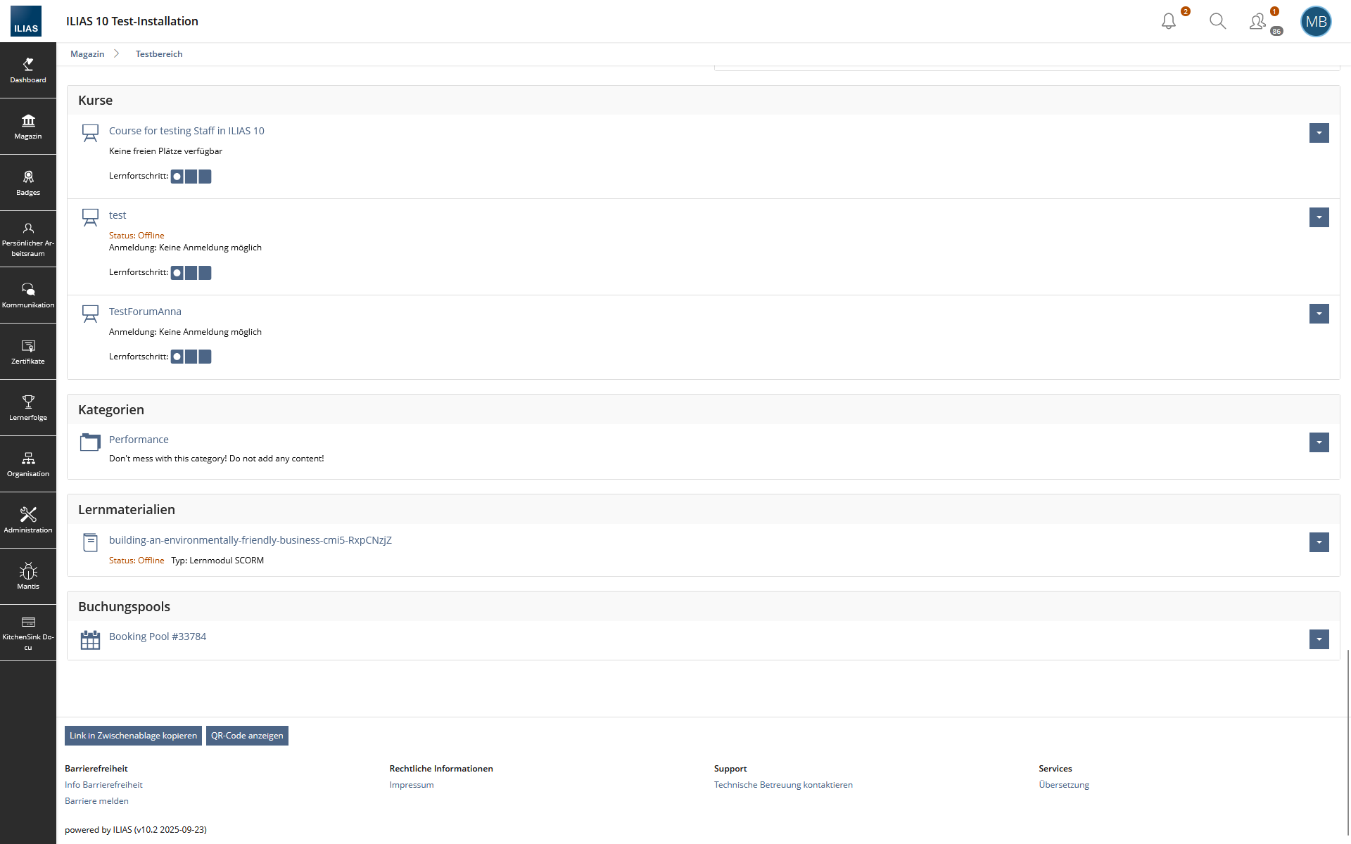
 Using the standard button
 Using the shy button
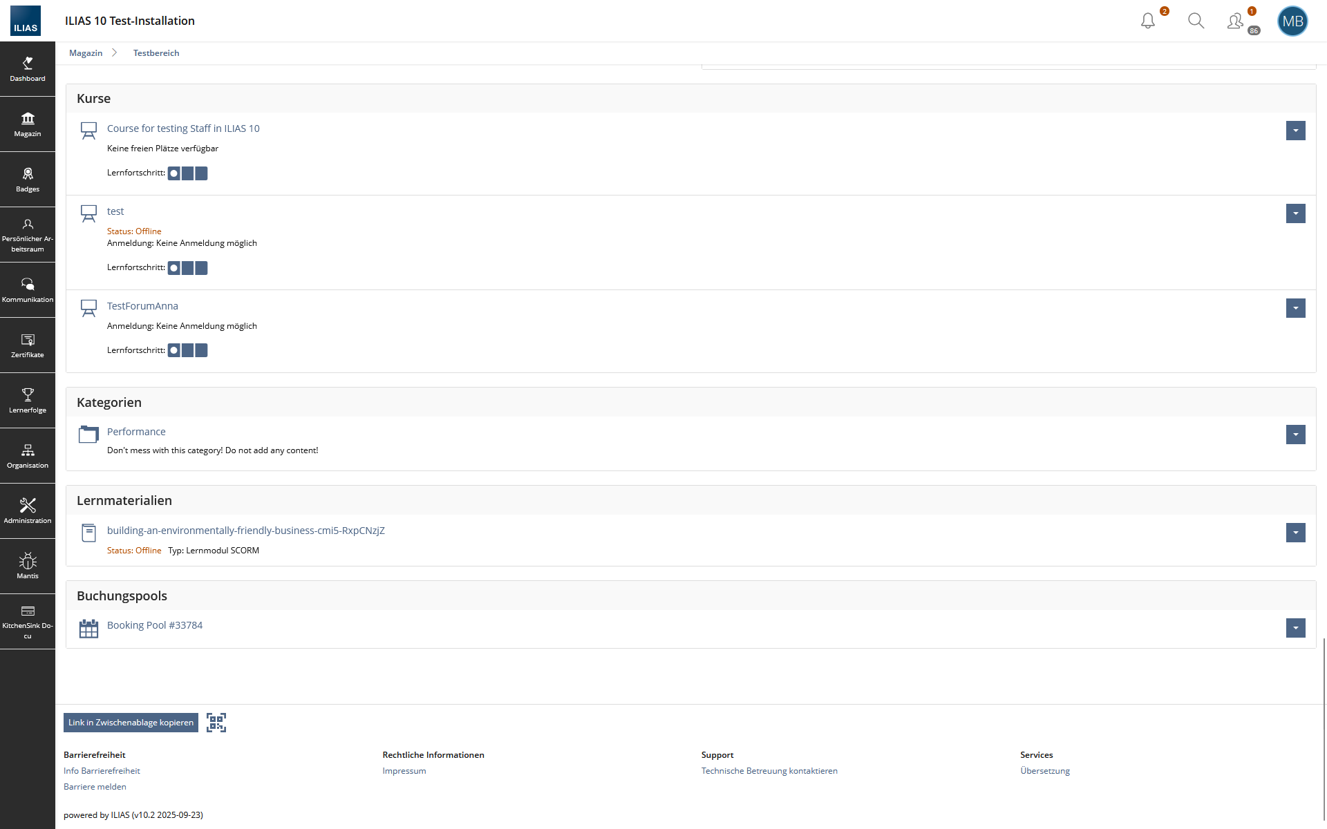 Using the shy button only as Icon
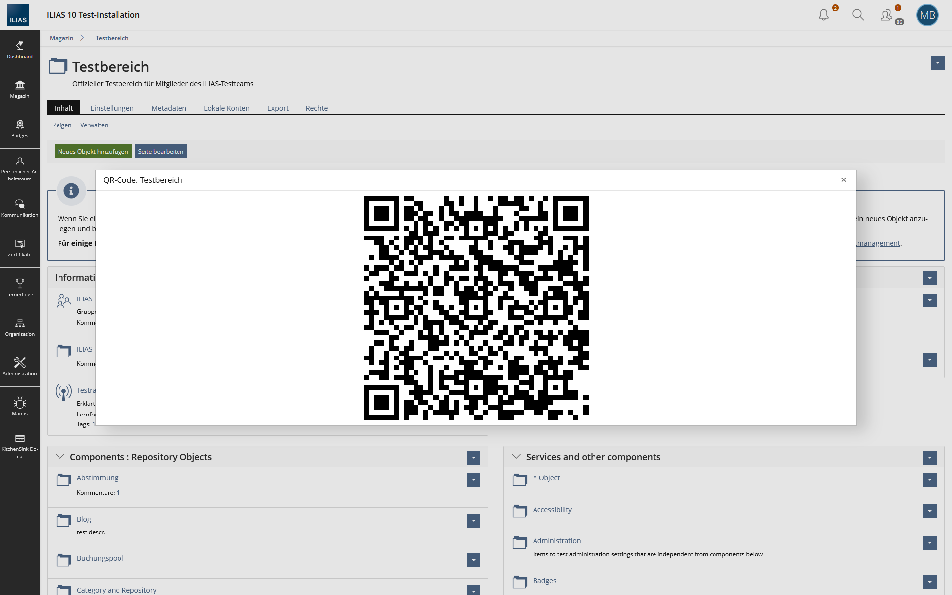 QR code in modal
3.3 New User Interface Concepts
A new KS component 'QR Code' is required. It should take a string as input, and return the corresponding QR code as an image.
3.4 Accessibility Implications
{ If the proposal contains potential accessibility issues that are neither covered by existing UI components nor clarified by guidelines, please list them here. For every potential issue please either propose a solution or write down a short risk assessment about potential fallout if there would be no solution for the issue. }
4 Additional Information
4.1 Involved Authorities
- Authority to Sign off on Conceptual Changes: Samoila, Oliver [oliver.samoila] & Fuhrer, Thibeau [tfuhrer]
- Authority to Sign off Code Changes: Samoila, Oliver [oliver.samoila] & Fuhrer, Thibeau [tfuhrer]
If this request is related to multiple components, please list both authorities for all related components.
4.2 Technical Aspects
QR codes should be generated server side, e.g. using endroid/qr-code. A variety of similar libraries is available, so there is no risk of getting locked into a dependency.
The QR code KS component should offer options for different error correction levels and sizes for the generated code. Reasonable values of those parameters depend on the expected length of the string, and of the context of its usage (QR codes that are printed on paper benefit more from a higher error correction than those shown on a screen, for example).
4.3 Privacy
{ Personal data that will need to be stored or processed to implement this feature have to be listed here. For each date give a short explanation why it is necessary to use that date. }
4.4 Security
{ Does the feature include any special security relevant changes, e.g. the introducion of new endpoints or other new possible attack vectors. If yes, please explain these implications and include a commitment to deliver a written security concept as part of the feature development. This concept will need an additional approvement by the JourFixe. }
4.5 Contact
Person to be contacted in case of questions about the feature or for funding offers: {Please add related profile link of this person}
4.6 Funding
Funding status and funding parties are listed in the block 'Status of Feature' in the right column of this page.
If you are interested to give funding for this feature, please get into contact with the person mentioned above as 'Contact'.
5 Discussion
Becker, Matthias [matthias.becker], 02 JUN 2026: Hi everyone,
as discussed in the PR #11570, I'm continuing the discussion here in the feature request to provide more transparency.
This is Part 1 of my new feedback - I'll follow up with Part 2 tomorrow. Today I ran a short focus group including a survey among a group of people at my university who work extensively with ILIAS and use it heavily. We focused on icon meaning, button implementation (with or without labels), and potential improvements. I also have short sessions planned with 8 students tomorrow afternoon, since in my opinion feedback from everyday users is even more important than from power users - simply because there are far more of them. That said, I wanted to share this first round now so it's available in an organized form and you have the chance to give feedback on this part before the holiday.
For the focus group, I asked participants what they thought each button does. I removed all labels beforehand, as I specifically wanted to test the visual language of the icons and find out whether icons alone are sufficient.
- "For pasting"
- "Share or import a calendar entry"
- "Generate a permanent link to the current page"
- "Looks like paste"
- "Input"
- "That I'll find something below"
- "Copy link"
- "Copy"
- "It's for sharing"
- "Open new tab"
- "Generate a permanent link to the current page"
- "Copies link to clipboard"
- "Link to another page"
- "Take something and put it somewhere else"
- "No idea"
- "Redirect"
- "Scan QR code"
- "Show all apps"
- "QR code"
- "Generate a QR code for the page"
- "QR code, link to somewhere"
- "Display QR code"
- "QR code for the page"
- "Generate QR code"
- "An additional description"
- "Larger icons with accompanying text"
- "Larger buttons, short explanation on hover"
- "Better visibility (larger); written word on hover"
- "Text"
- "Alt text"
- "Explanations for the icons"
- "Label"
- 4× "Link to this page"
- 4× "Permanent link"
Unfortunately I wasn't able to collect feedback on the input field from the full group since we ran out of time, but 4 users gave me informal feedback that they find the input field more disruptive than useful.
Verbal Feedback (Between Questions)
The group strongly agreed that all buttons need text labels.
The question came up why the most recognizable copy and share icons aren't used instead. The group concluded that more familiar icons would be preferable for both actions. However, one could argue that, in the case of the Share icon, this is a matter of which operating system is most commonly used. The "three dots" icon is the standard Google/Android share icon, while the currently used icon (the "outgoing tray") is the iOS equivalent. I followed up via chat to ask the participants of the focus group which operating system each participant uses on their smartphone - it turned out to be 3 iOS and 5 Android users. However, only one person recognized the current icon as a share action in this context - who happened to be an Android user. Therefore, my recommendation would be to use the "three dots" variant, even though iOS is statistically increasing among younger generations. That said, tomorrow's sessions with students may yield different insights on this.
Copy alternative:

Share alternative:

It was also noted that buttons in ILIAS - and in this case as well - are generally very small, and that both the default font size and button size should be increased.
Short labels like Copy / Share / QR Code were considered useful. "QR Code" alone works, but "Show QR Code" would be slightly clearer about the action (though it lengthens the button).
The heading is currently quite small and can easily be overlooked in context. This means short button labels like Copy / Share / QR Code only make sense if it's visually clear what is being copied, shared, or displayed. From this I'd also conclude that for screen readers it's essential to either a) establish a clear programmatic connection between the section heading and the buttons, or b) use precise aria-labels that fully describe each action - e.g. "Copy link to this page" or "Copy permanent link" (depending on the chosen heading).
The visual feedback on the buttons is appreciated, but the tooltip is more noticeable and provides more precise feedback through its longer description.
My Recommendations
- Add labels to all buttons. The heading must be visually prominent and clearly frame the context for the buttons. If that's not achievable, the buttons themselves should be fully descriptive - e.g. "Copy link to this page".
- Define precise aria-labels for all buttons (including the QR code modal).
- Reconsider the icons for Copy and Share. The Share icon is not always clearly distinguishable from "open in new tab" or "open in new window." The Copy icon was frequently confused with Paste. If possible, swapping these for more recognizable and commonly used alternatives would help.
- Hide the input field unless there are use cases we haven't considered.
- Button size: I'd leave this aside for now, as it affects ILIAS's UI globally.
- Success/error feedback: I'm undecided here. A tooltip works poorly for the Share and QR Code buttons on success since those open modals. For error states, however, a tooltip would make sense - clear visual feedback is especially important when something fails.
I'll follow up tomorrow with feedback from everyday users (students) to see whether it aligns with what the power users reported.
Becker, Matthias [matthias.becker], 03 JUN 2026: Hi everyone,
This is Part 2 of my feedback. Only 6 out of the originally planned 8 students were able to participate, but the results were still very insightful.
As with Part 1, I asked participants what they thought each button does, with labels removed.
- "Paste"
- "Copy to clipboard"
- "Copy to clipboard"
- "Not clearly recognizable"
- "Copy page content"
- "Document input / document folder"
- "Share the page / its content"
- "Share the page / link"
- "Since the arrow points out of the box, I'd say the link is meant to be shared"
- "A link to the ILIAS page"
- "Copy link, possibly open new window"
- "Send / share"
- "Show QR code"
- "Display the page / content via QR code"
- "Open link as QR code"
- "Very confusing, not clear, some kind of QR code"
- "Copy link as QR code"
- "QR code"
- "Larger, with a hint word"
- "Info text that pops up on mouse hover or touch"
- "Icons slightly larger and more filling within the button. Maybe a hover effect or small labels to make it unambiguous"
- "Maybe add a verb to 'permalink' — for example 'copy'"
- "A keyword as a heading"
- "Larger, less detailed / more reduced icons so they remain meaningful even at small sizes. Some symbols were unclear"
- 2× "Permanent link"
- 4× "Link to this page"
Verbal Feedback (Between Questions)
The icons were recognized more readily by the students than by the power users - especially the Share icon.
Both the survey responses and the verbal feedback clearly indicate that all buttons should have labels.
Button and icon size was again criticized as far too small - this time even when zoomed in. This reinforces the need for labels: while students recognized the icon meaning better than the power users, they still criticized the icons as hard to see.
There was no strong preference for label length. Some favored longer labels like "Copy link / Share link / Show QR Code" at all times, while others found "Copy / Share / QR Code" sufficient when paired with a clear heading.
Two participants initially found the input field useful, thinking they could use it to verify whether the link in the address bar matched the link in the input field. Once informed that these links are not the same, they were quite confused by it. Following this, I asked all participants where they would copy a link to share - 5 out of 6 said they would use the address bar. This is a broader topic that has been discussed before, but it highlights in my opinion the need to revisit the link in the address bar - especially given that students at our university receive videos, guides as PDFs, an ILIAS help wiki, and an onboarding at the start of their studies explaining how and where to find the correct link for sharing in ILIAS.
The visual success/error feedback within the buttons was rated as barely noticeable, largely due to the small button size. Additionally, there was no error feedback at all for Mozilla Firefox users who had dom.webshare.enabled set to false (the default setting), meaning they were unable to use the share functionality without knowing why.
My Recommendations
- Add labels to all buttons. The heading must be visually prominent and clearly frame the context for the buttons. If that's not achievable, the buttons themselves should be fully descriptive - e.g. "Copy link to this page".
- Define precise aria-labels for all buttons (including the QR code modal).
- Reconsider the Copy icon. Since everyday users (students) recognized the Share icon without a label - and seeing that it's also the icon used in the share modal - the visual language appears to work. Users who don't recognize it will be helped by the label "Share" or "Share link". The Copy icon, however, remains more ambiguous and should still be reconsidered if possible.
- Hide the input field unless there are use cases we haven't considered.
- Button size: I'd still leave this aside for now as it affects ILIAS's UI globally, but after the student feedback it's clear this is something that should be addressed more broadly - almost all participants across both sessions criticized the buttons as noticeably too small.
- Success/error feedback: I'm still undecided, but lean towards tooltips (I'd appreciate an accessibility perspective here). The student feedback shows that the in-button feedback is not visually prominent enough, which is largely tied to button size. Additionally, no error message was shown when the Web Share API was disabled in browser settings - this would be an important signal to communicate to the user.
JourFixe, ILIAS [jourfixe], 13 JUL 2026: Thibeau and Fabian told us about the new transfer component and its options and possibilities for ILIAS. We highly appreciate this suggestion and accept the feature for trunk. A final decision about the visual implementation of the permanent link, the buttons and additional information will be made by the UI experts and involved authorities.
6 Implementation
Feature has been implemented by Fuhrer, Thibeau [tfuhrer] (sr solutions ag)
Current state is available here: https://github.com/ILIAS-eLearning/ILIAS/pull/11570
6.1 Description and Screenshots
{ Description of the final implementation and screenshots if possible. }
6.2 Test Cases
Test cases completed at {date} by {user}
- {Test case number linked to Testrail} : {test case title}
6.3 Privacy
Information in privacy.md of component: updated at {date} by {user} | no change required
6.4 Approval
Approved at {date} by {user}.
Last edited: 13. Jul 2026, 15:24, Kunkel, Matthias [mkunkel]